It’s done…Punch list boxes checked…IN THE CAN!
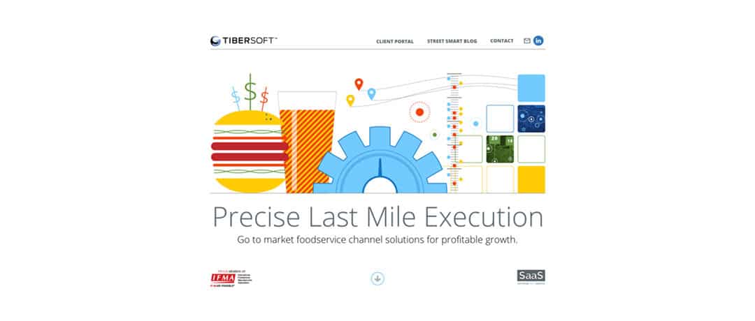
The new Tibersoft website went live this week. It is hard not to go on about how great we think it is – if only we were the audience.
So I’ll summarize what we were trying to do and we’ll see what you think.
UPGRADED MESSAGING: We’re one-stop analytics for foodservice, PERIOD. We’re focused on helping Clients achieve precise profitability in one easy-to-find, actionable insight at a time.
PEOPLE MAKE IT HAPPEN: The most satisfying part of this project was building out the Client quotes about our team. You can find them in the slider at the end.
MOBILE SUPPORT: Mobile traffic (phones & tablets) has been running above 30%. This new site can be entirely navigated with a finger flick.
MORE DIGESTIBLE GRAPHICS: We refined the climbing metaphor. Our solution diagram only has two parts: our software, Explore, which has really taken center stage, and OpTRADE, the data engine behind the scenes. Finally, we added a few graphics from our upcoming mobile version of Explore. News flash from our Solution Architecture Team: rows and columns do not work on a phone!
FIRST LOOK IS THE FIRST STEP: With our First Look pilot program, we’re doubling down on our promise to document the business case using your data. I shot the cloud scene from my window seat a few weeks ago. The sun was just dipping below the horizon and changing the color of the clouds as it fell. It was a serene moment.
Feedback appreciated!
Chris


